Sunday, 23 September 2012

The End of Print: The Graphic Design of David Carson


This lecture from David Carson is really inspiring. Some quotes I found useful for the research I am doing:

"The End of Print is now in it's fifth printing. When photography was perfected, they said it would be the end of painting, of course it wasn't. "

"Trying to use print as a medium to get people to the web." 

David Carson is an American graphic designer. He is best known for his innovative magazine design, and use of experimental typography. He was the art director for the magazine Ray Gun. Carson was perhaps the most influential graphic designer of the 1990s. In particular, his widely imitated aesthetic defined the so-called "grunge typography" era.
In 1989 Carson became art director at the magazine Beach Culture. Although he produced only six issues before the journal folded, his work there earned him more than 150 design awards. By that time, Carson’s work had caught the eye of Marvin Scott Jarrett, publisher of the alternative-music magazine Ray Gun. Ray Gun explored experimental magazine typographic design. The result was a chaotic, abstract style, not always readable, but distinctive in appearance.

The End of Print: The Graphic Design of David Carson, Lewis Blackwell, Lauren King Publishing, 1995, Spain. 


These are some covers from Beach Culture & Ray Gun magazines. 


I agree with how printed design is more personal in the way that you can feel the texture, weight, size etc. When you view things online it takes away this pleasure. 


I definitely agree that technology development is changing how design is being viewed. I think a lot of this is down to social networking. Its so easy to find things and learn from people that inspire you with the likes of twitter and facebook. 


Wednesday, 19 September 2012

magCulture - New Magazine Design

magCulture - New Magazine Design, Jeremy Leslie, Laurence King Publishing, 2003, London. 


Bulgaria - This issue came in a cloth bag featuring a motif that symbolises the forests which surround and protect Finland and it's people


Spektacle - Magazines on pc-rom are normally stuck on magazine-sized pieces of card to increase their size and prominence to potential readers. 


Re- - It is made up of sheets folded once and bounded together by a rubber band where the spine would normally be. Readers have to remove the rubber band to see some spreads which is good interactivity. 


Nice magazine - The ultimate experiment in magazine format? It's the same size, thickness and weight as a standard magazine but pick it up and it's a solid piece of wood. An artful joke about the state of magazines and serious comment about the destruction of forests for paper. It's been a best seller. 


Archis - Their series of front covers ignores all the rules of cover design with a multi layered mix of samples from each issues content. 

M-real - The cover of this magazine with no name changes to reflect the issue. 


Spector Cut & Paste - Spread by spread the number of pictures decreases as the volume of words increases, gently drawing the reader into the article. 

Label - The Italian language is run on a black background and the English is ran on a white to prevent confusion. 


Self Service - Black and white typography has long been a trademark of this magazine, one of the new breed of microzines. 


Nest - Traditional wallpaper and tile patterns are a key influence of this magazine. 


Nylon - The type elements here have been both handwritten and printed, rescanned and auto-traced to achieve this loose, distressed effect. 


Hint - Available solely online, this fashion magazine uses the immediacy and animation possibilities of the Web to create a different type of magazine in an overcrowded market.


Dazed & Confused - Photographs printed onto fabric are embroidered with coloured thread.


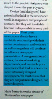
This book ahs helped me learnt that the advent of the apple mac has allowed designers to have contorl over content and editors to have control over presentation. Eye magazine hadboth website and magazine designed together and proved an unusually harmonious marriage of the two. This was a quick way to communicate some of the content of an article. 

www.showstudio.com is a publishing vehicle for new fashion imagery. They rejected print in favour of a website because of the global audience and distribution. Motion imagery online benefits the fashion industry because you can see how a dress can move. There is a crippling expense of print in comparison to the web and colour and shape have more impact in web shoots.