magCulture - New Magazine Design, Jeremy Leslie, Laurence King Publishing, 2003, London.
 |
| Bulgaria - This issue came in a cloth bag featuring a motif that symbolises the forests which surround and protect Finland and it's people |
 |
| Spektacle - Magazines on pc-rom are normally stuck on magazine-sized pieces of card to increase their size and prominence to potential readers. |
 |
| Re- - It is made up of sheets folded once and bounded together by a rubber band where the spine would normally be. Readers have to remove the rubber band to see some spreads which is good interactivity. |
 |
| Nice magazine - The ultimate experiment in magazine format? It's the same size, thickness and weight as a standard magazine but pick it up and it's a solid piece of wood. An artful joke about the state of magazines and serious comment about the destruction of forests for paper. It's been a best seller. |
 |
| Archis - Their series of front covers ignores all the rules of cover design with a multi layered mix of samples from each issues content. |
 |
| M-real - The cover of this magazine with no name changes to reflect the issue. |
 |
| Spector Cut & Paste - Spread by spread the number of pictures decreases as the volume of words increases, gently drawing the reader into the article. |
 |
| Label - The Italian language is run on a black background and the English is ran on a white to prevent confusion. |
 |
| Self Service - Black and white typography has long been a trademark of this magazine, one of the new breed of microzines. |
 |
| Nest - Traditional wallpaper and tile patterns are a key influence of this magazine. |
 |
| Nylon - The type elements here have been both handwritten and printed, rescanned and auto-traced to achieve this loose, distressed effect. |
 |
| Hint - Available solely online, this fashion magazine uses the immediacy and animation possibilities of the Web to create a different type of magazine in an overcrowded market. |
 |
| Dazed & Confused - Photographs printed onto fabric are embroidered with coloured thread. |
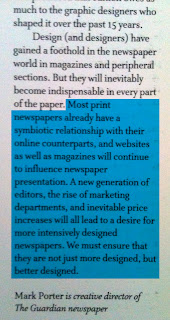
This book ahs helped me learnt that the advent of the apple mac has allowed designers to have contorl over content and editors to have control over presentation. Eye magazine hadboth website and magazine designed together and proved an unusually harmonious marriage of the two. This was a quick way to communicate some of the content of an article.
www.showstudio.com is a publishing vehicle for new fashion imagery. They rejected print in favour of a website because of the global audience and distribution. Motion imagery online benefits the fashion industry because you can see how a dress can move. There is a crippling expense of print in comparison to the web and colour and shape have more impact in web shoots.


Hi im rida and im hoping to use the 'nice magazine' as a case study in my class work but whenever i search it up im taken to magazine racks until i found your article!! So i was wondering if u could share more info about it like who published it and maybe a link to the creator so i can do more of my own research!! Thank you
ReplyDelete